.png)
Aora Case Study: Banking That Feels Lighter
Can financial products be easy to set up and even easier to manage? Aora believed they could. We helped turn that promise into a brand system designed to make people believe it.
COMPLETION YEAR
2026
TIMEFRAME
4 weeks
CLIENT
aora
SECTOR
Finance
Aora is a new credit card service built for young professionals who want the benefits of credit without the usual friction of traditional banking.
Our role was to help define how this product should enter the market: what it should stand for, how it should sound, and how it should look and feel across every touchpoint.
Aora's identity
The product is designed to be fast to set up, transparent to understand, and flexible to use. Users can access credit with lower fees, earn cashback on purchases, manage multiple cards, set spending limits, create digital cards, and automate parts of their account experience from a simple app.
Branding System
Closing the gap between brand promise and visual identity
The challenge was strategic. Aora did not need a decorative fintech skin. It needed a brand system that could communicate a real product advantage: banking with less tension, less opacity, and less wasted time.
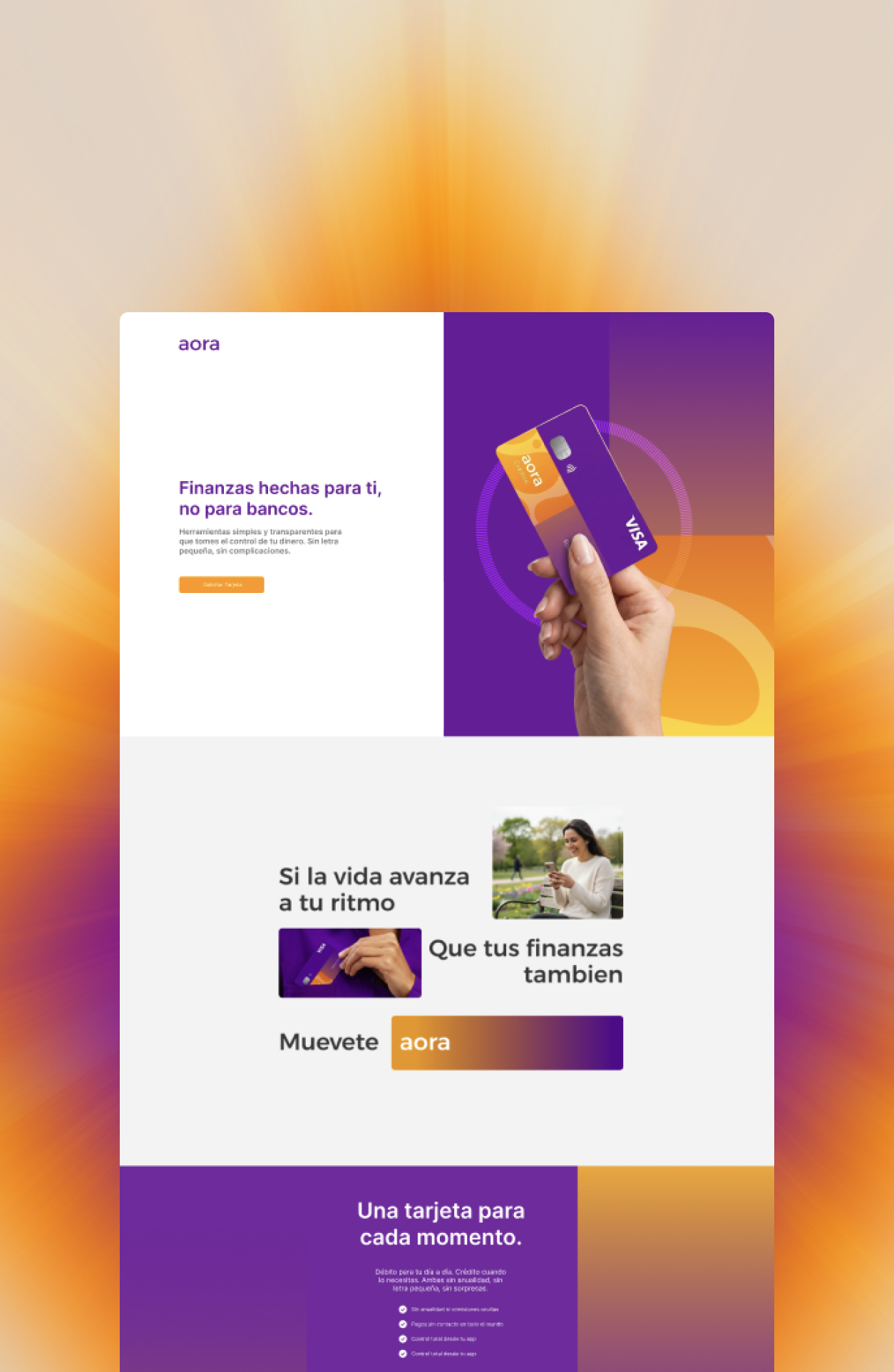
FIG 01. AORA landing page
Some brands need more than words to be experienced
The visual direction was built to reinforce the balance between being approachable and professional. Purple gives the brand confidence and trust, while warmer accents add energy and accessibility. The image system brings the card and app into real-life contexts, helping the product feel approachable rather than abstract. Motion and animation support the idea of ease, showing progress, speed, and flow throughout the experience.
We established a unified design language that could be deployed across mobile interfaces, station kiosks, and internal operator dashboards, ensuring a seamless experience regardless of the access point.
.png)
FIG 02. Brand design system for aora.
THE SOLUTION
Centralized design assets that scale infinitely.
We also created an AI-ready design system to help the brand scale beyond the first set of assets. Through a design.md source of truth, reusable code blocks, shaders, and documented asset logic, we gave team members and AI tools a practical way to understand and apply the brand correctly.
This meant future social posts, communications materials, animations, and landing assets could be created faster, with clearer guardrails and stronger consistency. We established a unified design language that could be deployed across mobile interfaces, station kiosks, and internal operator dashboards, ensuring a seamless experience regardless of the access point.
WATCH THE system in action
We make the branding promptable
We created an AI-ready design system that translated Aora’s brand into a structured production environment, not just a set of visual rules. The system included React components, shaders, reusable layouts, CSS classes, and a design.md file that explained each asset’s role, rationale, correct usage, and flexible variations.
This allowed both team members and AI assistants to understand how to combine, adapt, and extend the brand across social posts, landing pages, and campaign materials while preserving consistency, intent, and room for creative expansion.
the outcome
A brand system that is consistent, expandable but approachable
This brand work extended across landing pages, app screens, onboarding moments, social media assets, videos, animations, product materials, and AI-assisted production workflows. Every asset was built around the same narrative: credit can be simpler, faster, and calmer.
The result is a brand platform that gives Aora a clear strategic position in the market and a system for growing that identity over time. It does not compete by looking louder than traditional banks. It competes by making credit feel lighter, more transparent, and more aligned with how young professionals actually want to live.
70
Screens and dialogs for the landing page and mobile app
120
Design tokens configured and codified in the design.md instructions file
5
shaders and textures dynamically controllable
Some Examples of aora visual system
START A PROJECT
Let's build something that matters.
We partner with ambitious organizations to solve complex problems through strategic design and world-class engineering.